Understanding Healthcare Deserts in America
Over 80 million Americans live in areas designated as healthcare deserts. Learn what causes these gaps in access and how they affect communities across the country.
Read Article
All Articles
How to Read Your ZIP Code Health Score
Your ZIP code health score is more than just a number. Learn what each component means, how scores are calculated, and what you can do with this information.

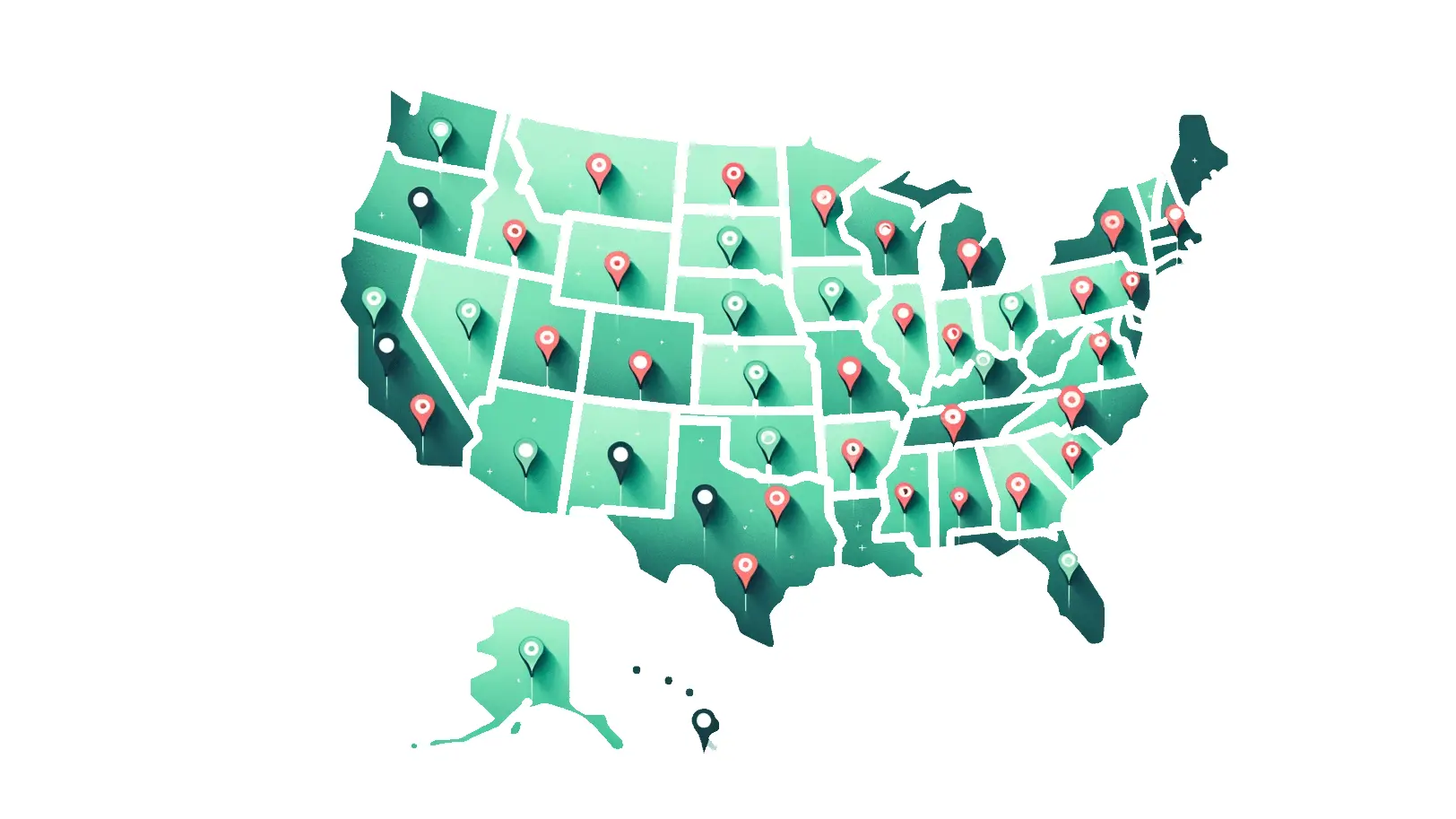
The Future of Healthcare Access Mapping
From static reports to real-time interactive maps, healthcare access visualization is evolving rapidly. Here is where we see the technology heading.
The Mental Health Crisis: Why 150 Million Americans Can't Find a Therapist
Over half the U.S. population lives in a mental health professional shortage area. The gap between demand and supply is widening -- and geography is the biggest predictor of whether you can get help.
5 Things to Check Before Moving to a New ZIP Code
You check school ratings and neighborhood scores before buying a home. Healthcare access should be on that list too. Here are five data points that could save your life -- or at least save you a two-hour drive to the ER.
How We Score 33,000 ZIP Codes with Zero Manual Work
Every month, CartoChrome ingests data from 21 federal sources, recomputes 363,000 health scores, and publishes updated maps -- all without a human touching a keyboard. Here is how the pipeline works.
E2SFCA Explained: The Math Behind Healthcare Access Scores
The Enhanced Two-Step Floating Catchment Area method is the academic gold standard for measuring spatial healthcare access. Here is how it works -- explained without a statistics degree.
Rural vs Urban: Two Americas of Healthcare Access
A ZIP code in downtown Denver and a ZIP code in rural Wyoming are separated by more than miles. The gap in healthcare access between rural and urban America is growing -- and the consequences are measured in years of life expectancy.
21 Free Data Sources That Power CartoChrome
Every data point in CartoChrome comes from a free, public, federally maintained data source. No paid licenses, no data use agreements, no screen scraping. Here is the complete inventory.
Understanding Your Health Score: A Complete Guide
Your CartoChrome Health Score is a 0-100 composite that captures the healthcare access reality of where you live. This guide walks you through every component, what the labels mean, and how to act on the data.
Emergency Room Deserts: When 30 Minutes Means Life or Death
For heart attacks, strokes, and traumatic injuries, every minute matters. Yet 29 million Americans live more than 30 minutes from the nearest emergency department. The consequences are measured in preventable deaths.
Building Maps at Scale: From TIGER Files to Interactive Choropleth
Rendering 33,000 colored polygons and 4 million point markers at 60fps in a web browser requires a very specific technology stack. Here is how CartoChrome builds its maps -- from Census shapefiles to GPU-accelerated vector tiles.
Stay Informed on Healthcare Access
Weekly insights on healthcare deserts, new data releases, and feature updates. Join researchers, policymakers, and health advocates.
No spam. Unsubscribe anytime. We respect your inbox.
Explore by Topic
Are you a healthcare provider?
Claim your profile to connect with patients searching for care in their area. Update your information, respond to reviews, and track analytics.